Black Mint
Usability diagnosis for Black Mint refurbished electronics product page
79% failed the first-impression clarity check
The page never explains what “refurbished” means, so visitors can’t judge device quality.

Based on 14 Real verified customers
Real people reviewed this product page and shared what they understood, what confused them, and what almost made them leave.


37
Conversion Risks
The report identifies 37 conversion risks that prevent users from understanding the product condition and completing a purchase.
21
Positive feedback
The report highlights areas where users engaged positively with the product page and its features.
Simplified & Modernized Navigation
The header was completely redesigned from a cluttered two-row layout to a clean single-row navigation bar, addressing the usability feedback about information overload.
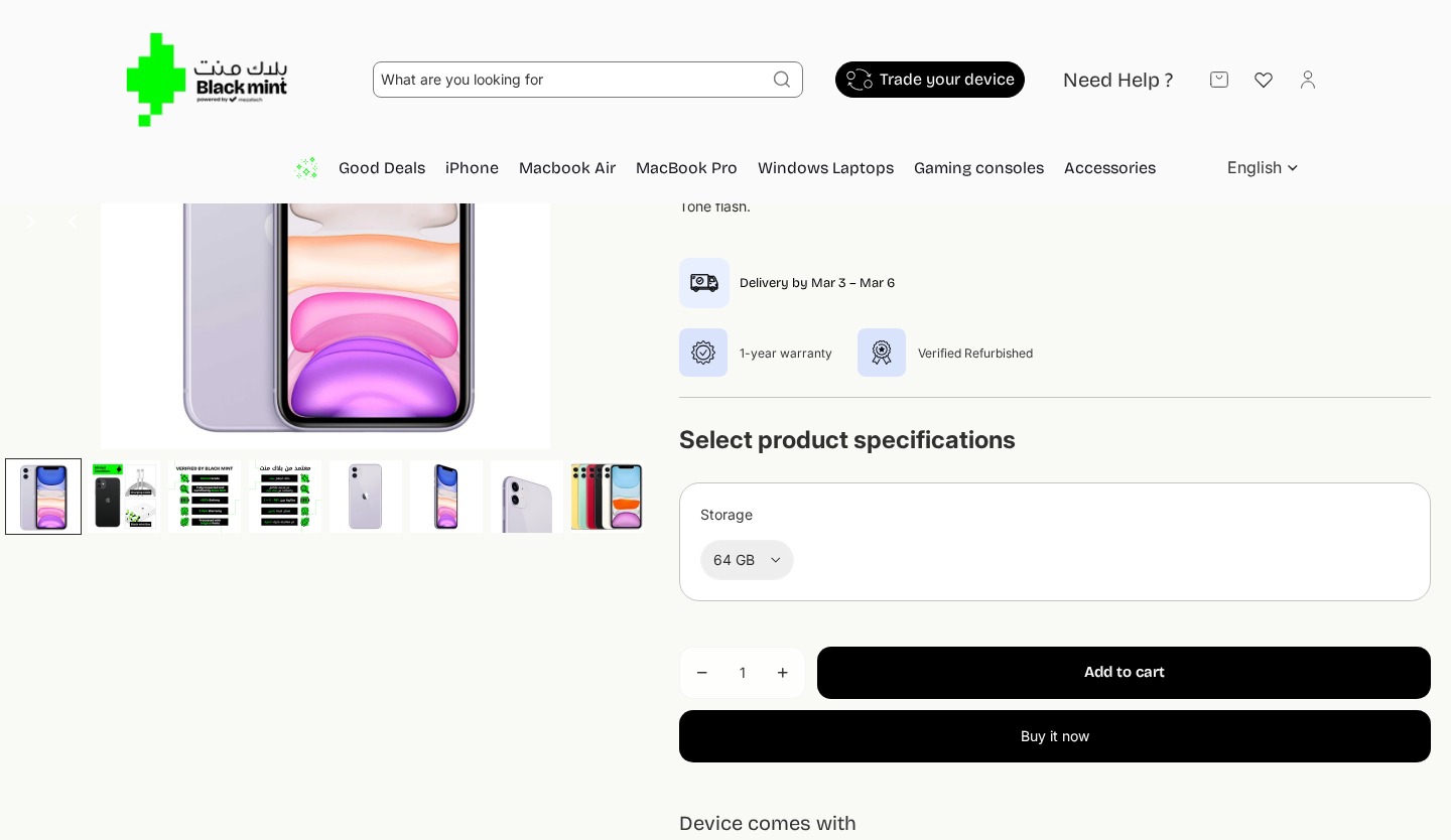
Changes
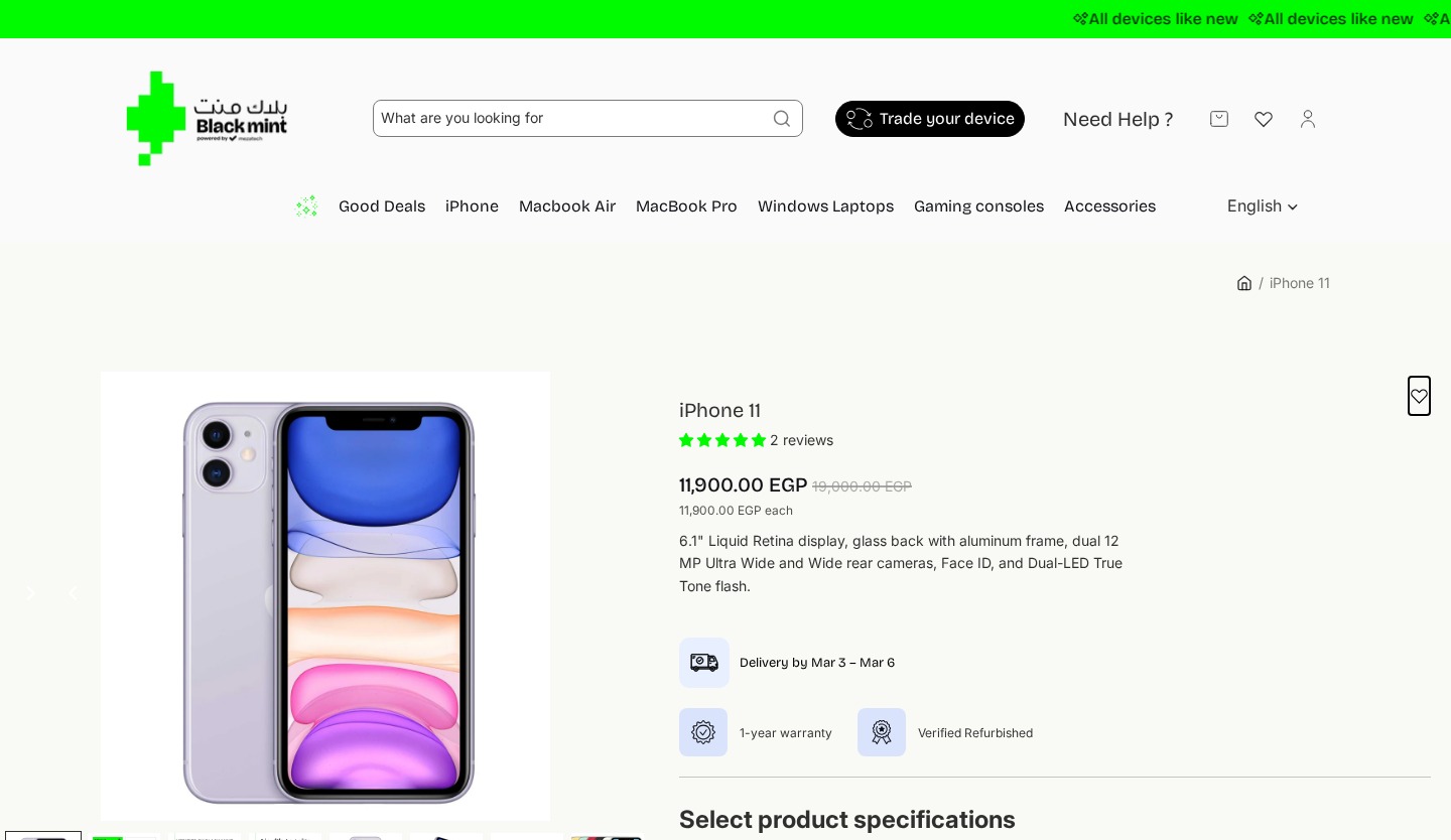
Removed the green “All devices like new” announcement bar that caused messaging confusion (2 of 14 users thought device was brand new)
Simplified from two navigation rows to a single clean header bar
Removed search bar, “Need Help?”, wishlist, and account icons from header
Removed “Good Deals”, “Gaming consoles”, “Accessories” categories — kept only core product categories
Removed language selector and breadcrumb navigation
Added clean Blackmint text logo replacing the bilingual Arabic/English logo
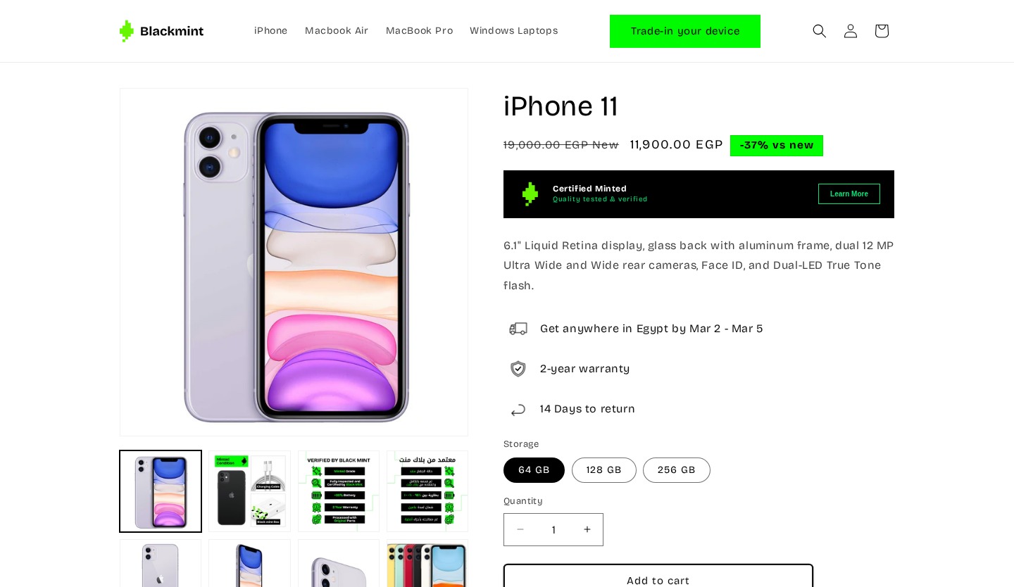
Enhanced Trust Signals & Pricing Clarity
The product hero was redesigned to address the critical feedback that users lacked confidence in the refurbished status. New trust elements and clearer pricing were added.
Changes
Added “-37% vs new” green badge next to price — making savings instantly visible
Price display now explicitly labels crossed-out price as “New” price for comparison
Replaced “1-year warranty” + “Verified Refurbished” badges with “Certified Minted” trust banner
Added delivery estimate: “Get anywhere in Egypt by Mar 2 – Mar 5”
Warranty upgraded from 1-year to 2-year with shield icon
Added “14 Days to return” policy with icon — previously missing from product page
Removed star rating and “2 reviews” count from hero area
Image gallery changed from horizontal strip to 2-row grid layout
From Vague Badge to Explained Certification
The “Verified Refurbished” badge — the most revisited element in testing — was replaced with a more descriptive “Certified Minted” system with a “Learn More” link, directly addressing the #1 user concern.
Changes
Replaced small “Verified Refurbished” icon with prominent “Certified Minted” banner
“Certified Minted” includes subtitle “Quality tested & verified” — explaining what it means
Added “Learn More” button — users previously had no way to learn more
Warranty upgraded from 1-year to 2-year warranty
Added delivery timeline and returns policy icons from product hero area
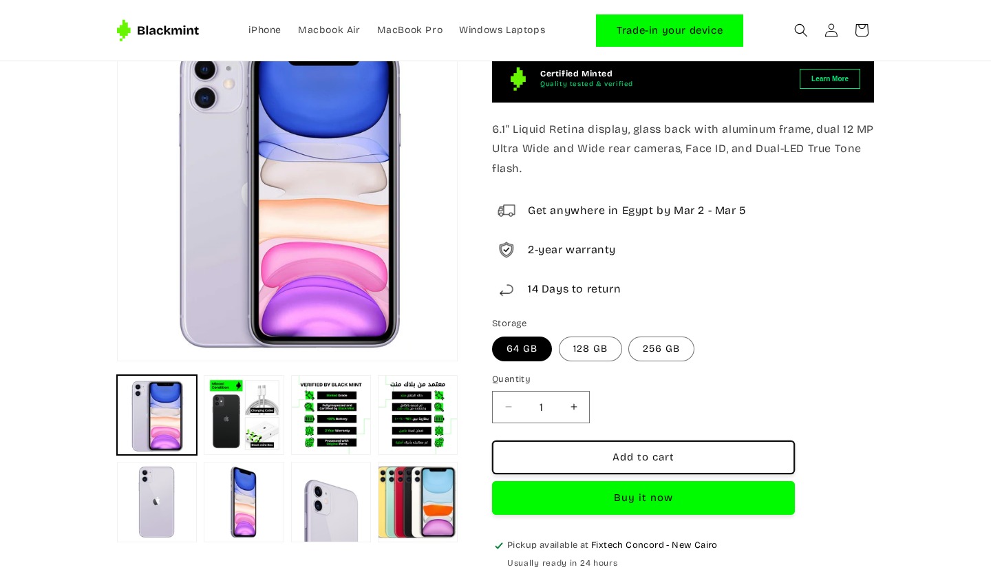
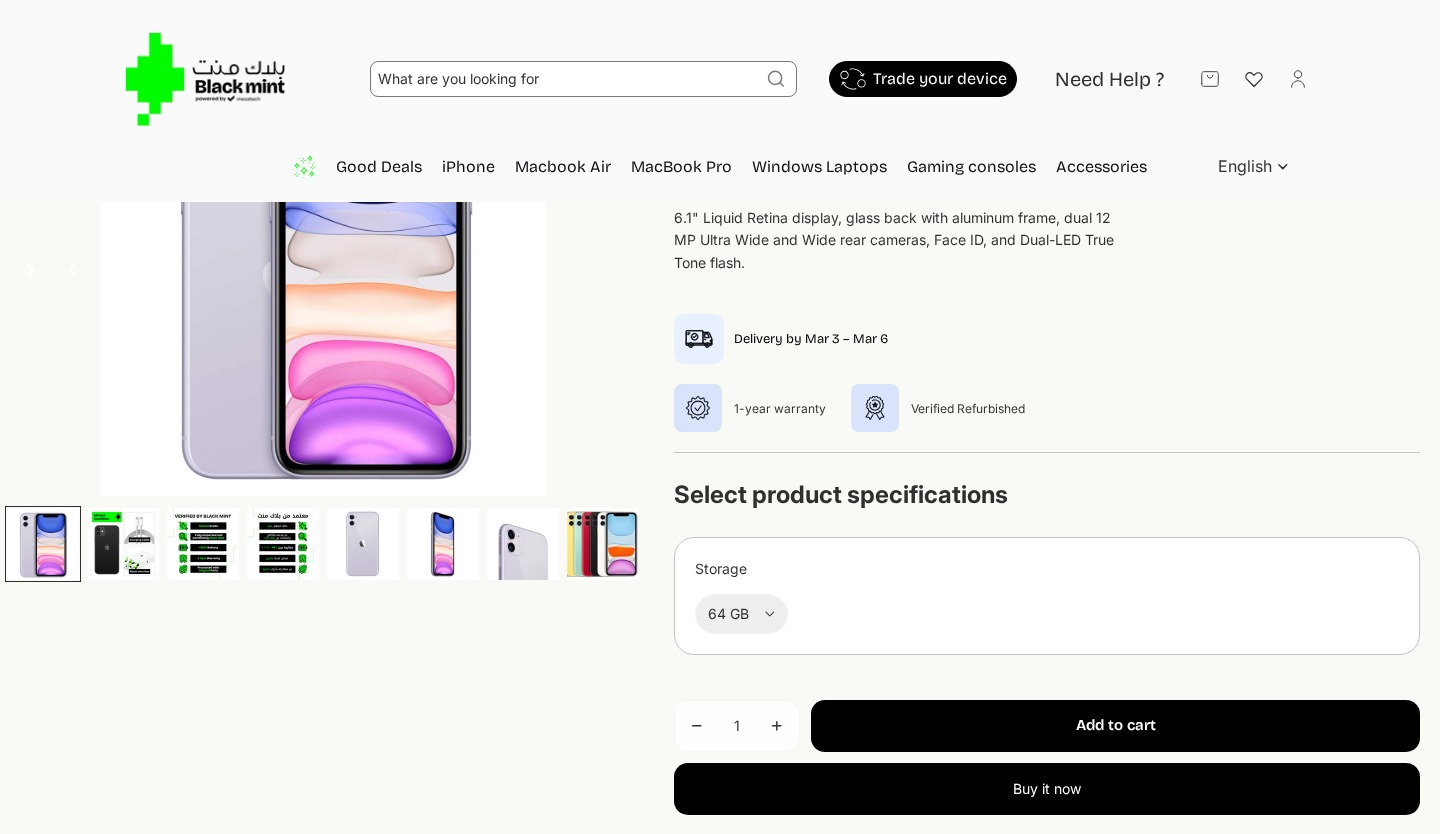
Button Selector Replaces Hidden Dropdown
The storage selector was redesigned from a nearly invisible dropdown to clear button options, addressing the finding that only 2 of 14 users interacted with it.
Changes
Changed storage from dropdown to visible button pills (64 GB / 128 GB / 256 GB)
Removed the large “Select product specifications” heading
Storage options immediately visible without clicking — addressing invisibility issue
Selected option shown with filled/active state
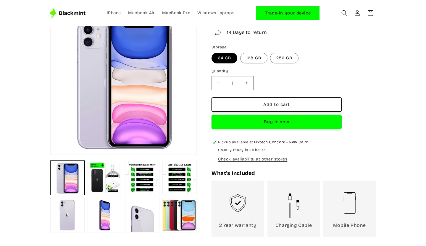
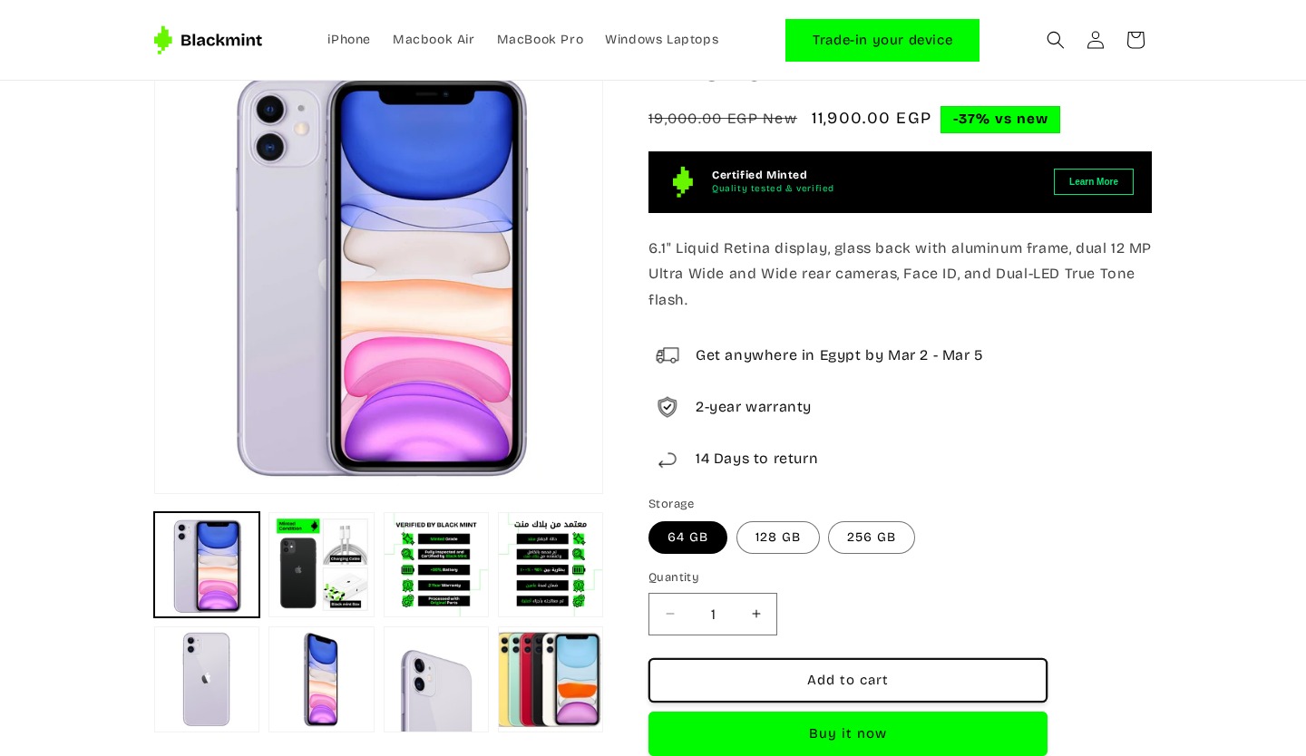
Refined CTA Styling & Pickup Info
The CTA buttons were restyled for better visual hierarchy, and pickup availability information was added.
Changes
“Add to cart” changed from black filled to outlined button — clearer hierarchy
“Buy it now” changed from black to bright green — more attention as primary CTA
Added “Pickup available at Fixtech Concord – New Cairo” with green checkmark
Added “Usually ready in 24 hours” and “Check availability at other stores” link
Quantity selector and CTA buttons stacked vertically for cleaner layout

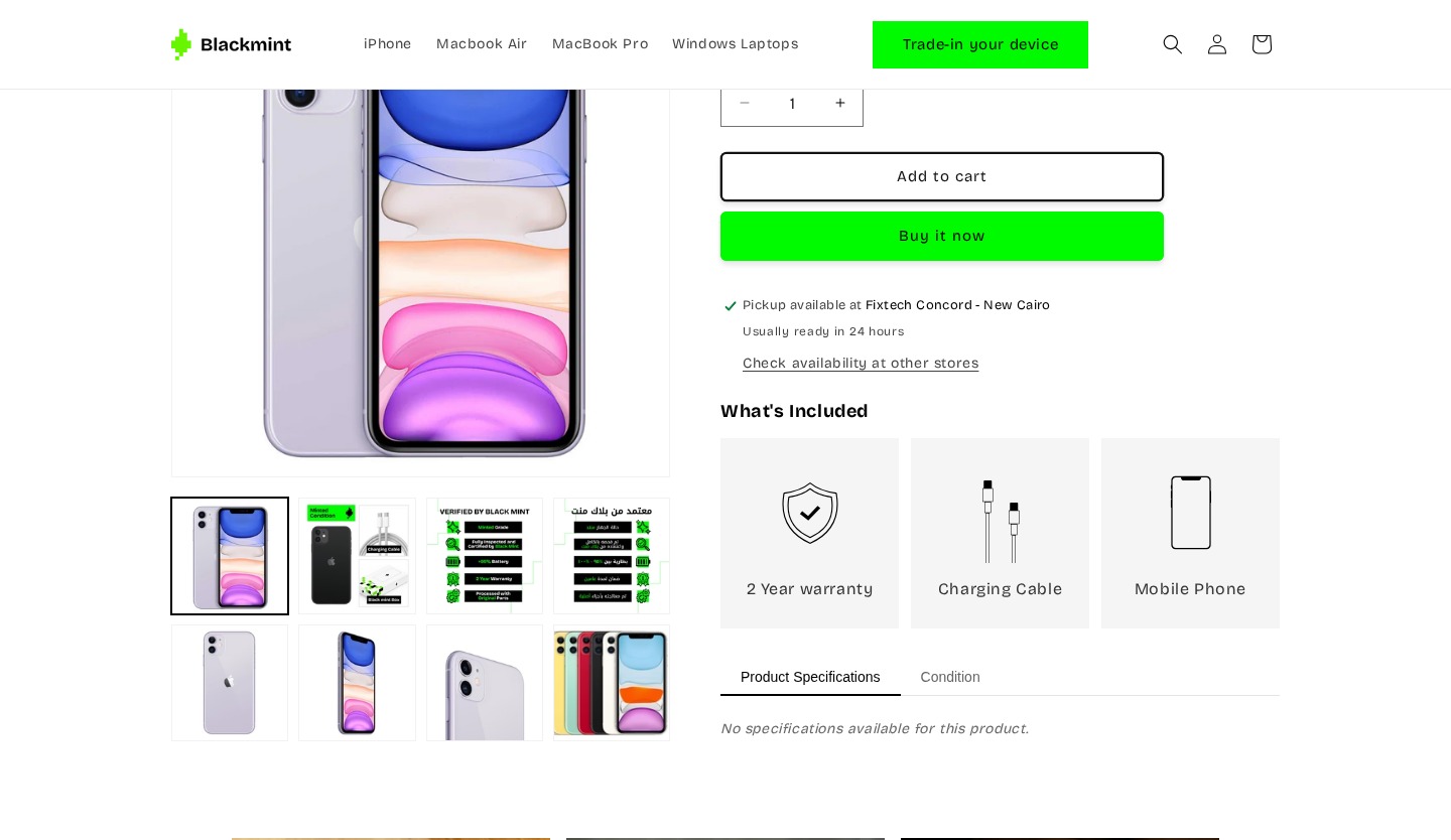
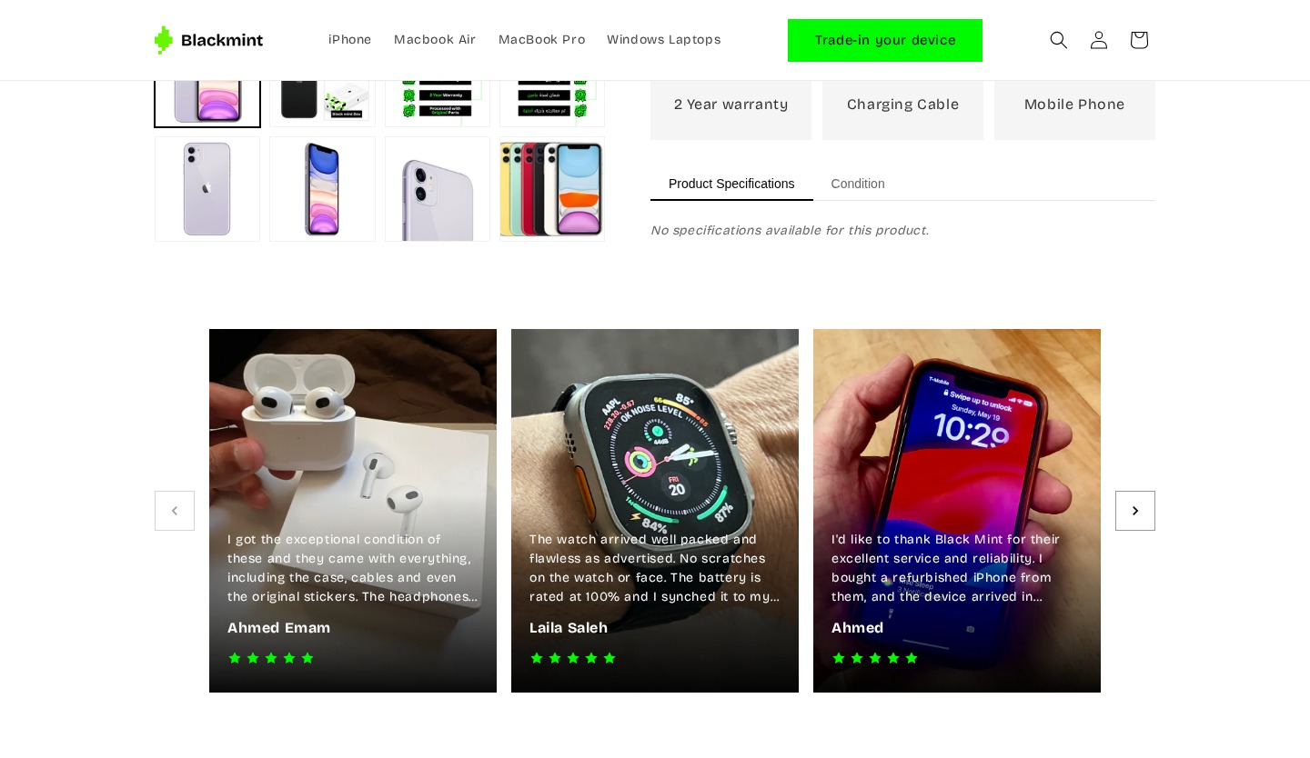
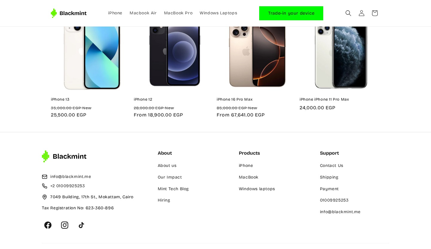
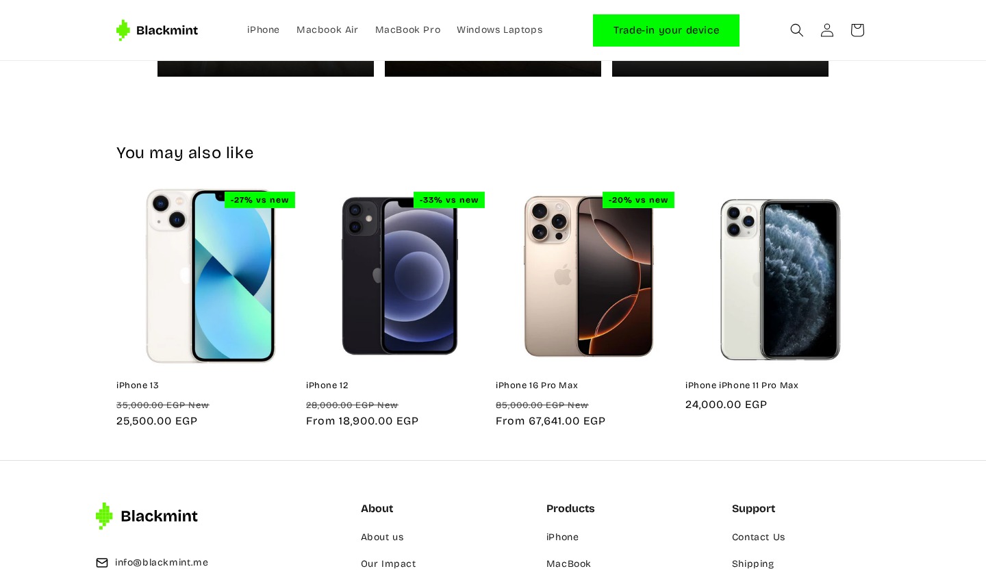
New Visual “What’s Included” Section
A completely new section replaces the old text-based accessory upsell that received zero engagement across all 14 sessions.
Changes
Brand new “What’s Included” section with icon cards for each item
Shows 3 items: 2 Year warranty (shield icon), Charging Cable (cable icon), Mobile Phone (phone icon)
Replaced old “Apple Lightning to Type-C Cable” text upsell nobody interacted with
Visual card layout with gray backgrounds makes inclusions scannable
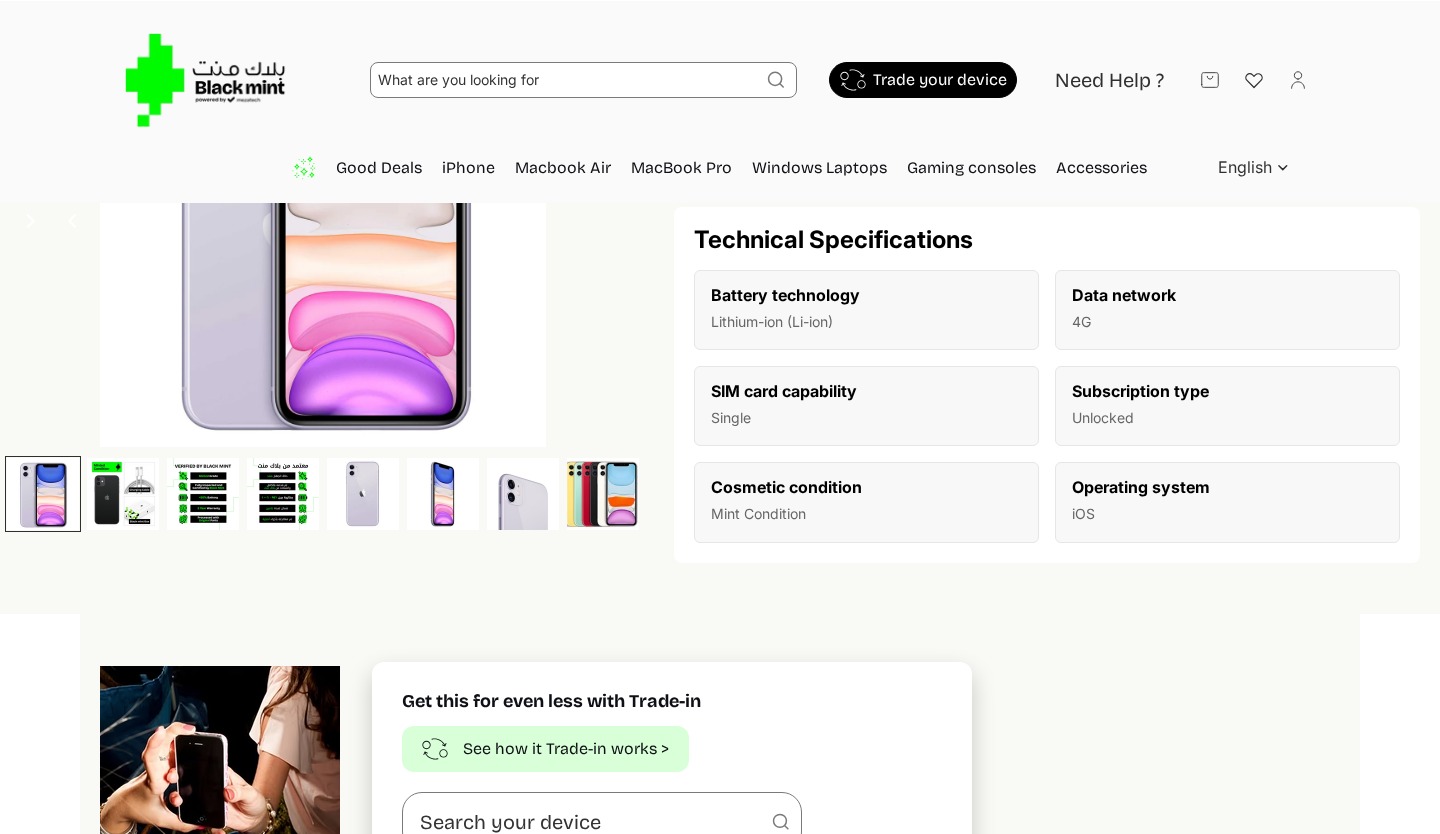
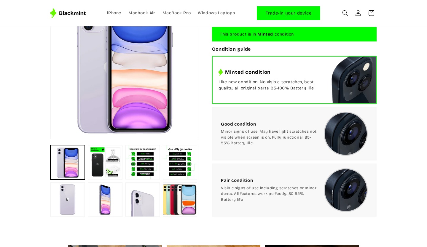
New Tabbed Condition Guide with Grading System
The most significant addition — a dedicated Condition tab and grading system directly addressing the #1 usability gap: users couldn’t understand device condition. Multiple users asked for battery health, screen condition, and body wear details.
Changes
Added “Condition” tab alongside “Product Specifications” — dedicated condition section
Green banner: “This product is in Minted condition” — immediate grade communication
3-tier grading system: Minted (95–100% battery), Good (85–95%), Fair (80–85%)
Each tier includes detailed description and close-up photo
Battery life percentages directly address user request for battery health
Addresses finding: “Cosmetic condition” was too vague — users wanted specifics
Reorganized into Tabbed Interface
Technical specifications moved into a tabbed interface alongside the new Condition tab, separating condition info from specs to address the feedback that specs ≠ condition info.
Changes
Moved from standalone section to tabbed interface (Product Specifications | Condition)
Tabbed approach separates condition info from specs — addressing user feedback
Cleaner layout reduces scroll distance to find condition information
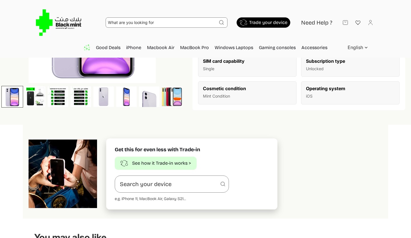
Removed Inline — Preserved in Header
The trade-in section was removed from the product page. Access preserved via the header “Trade-in your device” button. Removes the inline form that caused validation errors for both users who tried it.
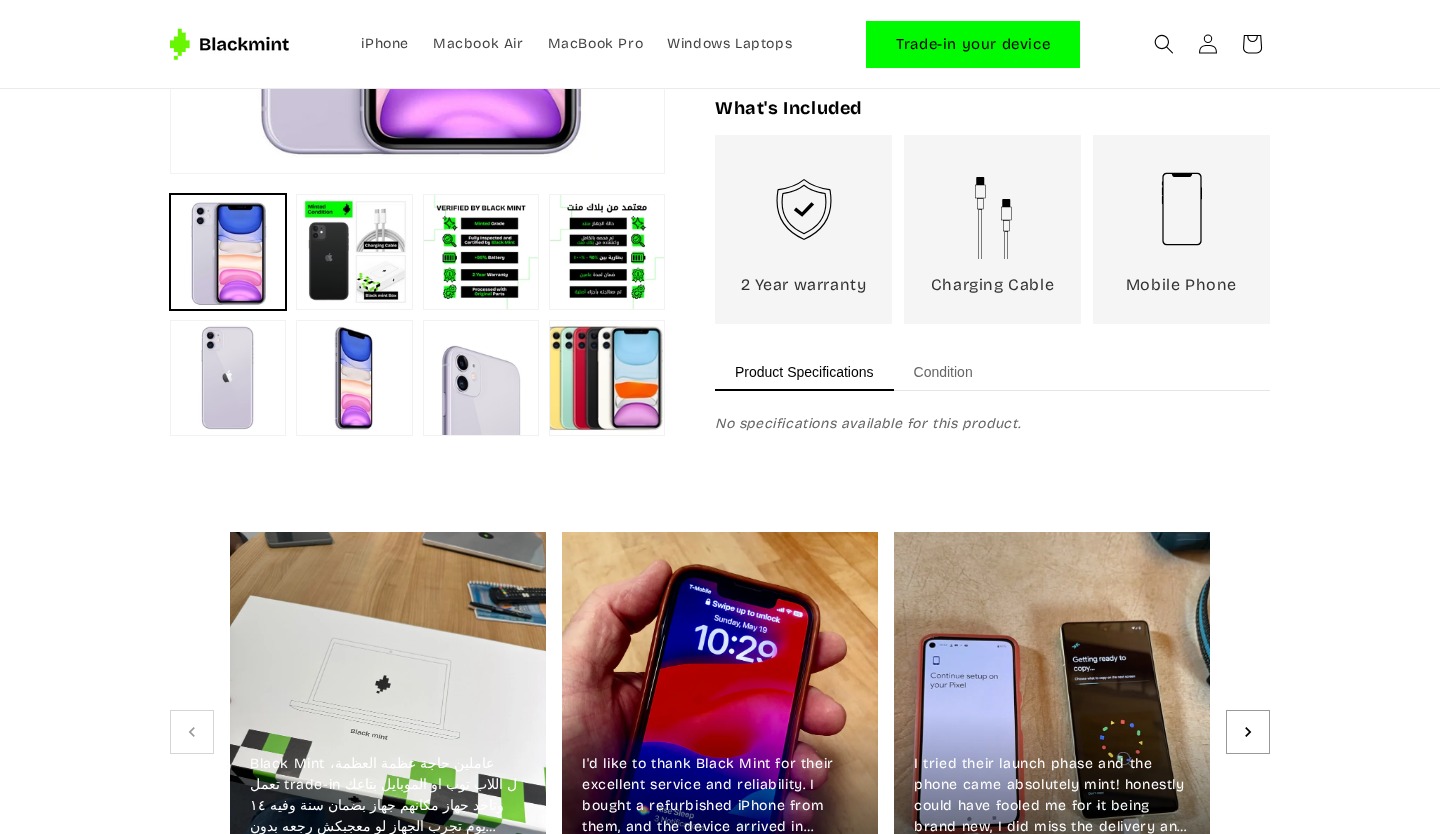
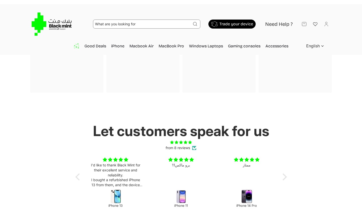
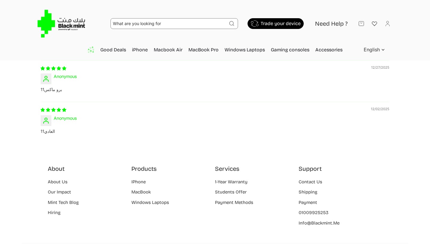
Rich Visual Testimonials Replace Anonymous Text
Testimonials were significantly upgraded from text-only anonymous reviews to rich visual cards with customer photos and real names, addressing the feedback that the old section failed to create social proof.
Changes
Replaced “Let customers speak for us” text testimonials with photo-rich cards
Each testimonial includes: customer photo, review text, full name, and star rating
Added English-language testimonials alongside Arabic — addressing the language barrier
Named reviewers instead of “Anonymous”
Carousel with navigation arrows for browsing more reviews
Removed standalone “Customer Reviews” widget with only 2 anonymous Arabic reviews
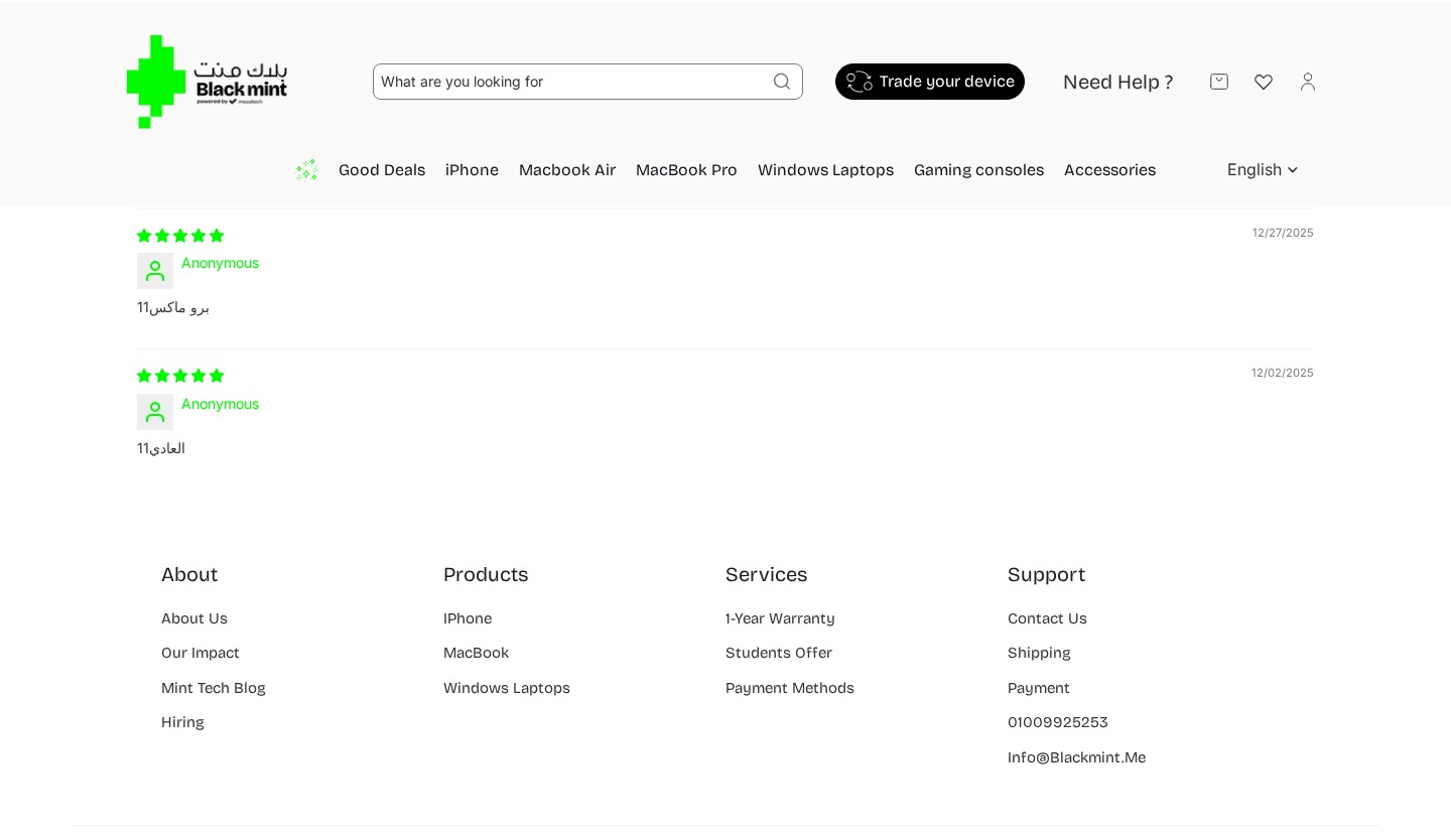
Enriched with Contact Details & Social Links
The footer was enhanced with direct contact information and social media links, addressing the finding that users used it as an “information escape hatch.”
Changes
Added direct email, phone, and physical address
Added Tax Registration number — building trust for Egyptian customers
Added social media icons: Facebook, Instagram, TikTok
Removed “Services” column; added “Powered by mezatech” branding


Get this level of clarity
Tailored to your product, your users, and your goals, so you know exactly what's working, what isn't, and what to fix next.