60% failed the first-impression clarity check
The page highlights outcomes but fails to clearly explain the product itself.

Based on 13 Real verified customers
Real people reviewed this landing page and shared what they understood, what confused them, and what almost made them leave.
20
Conversion Risks
The report identifies 20 conversion risks that prevent users from understanding the service.
21
Positive feedback
The report highlights areas that build trust and clearly explain the service.
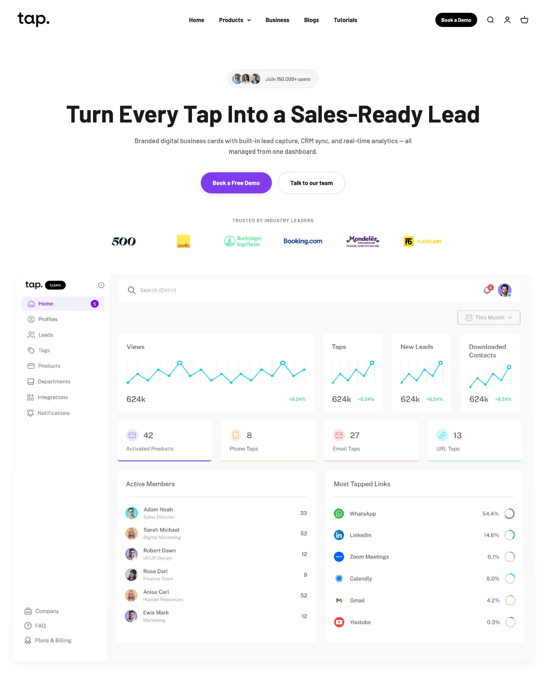
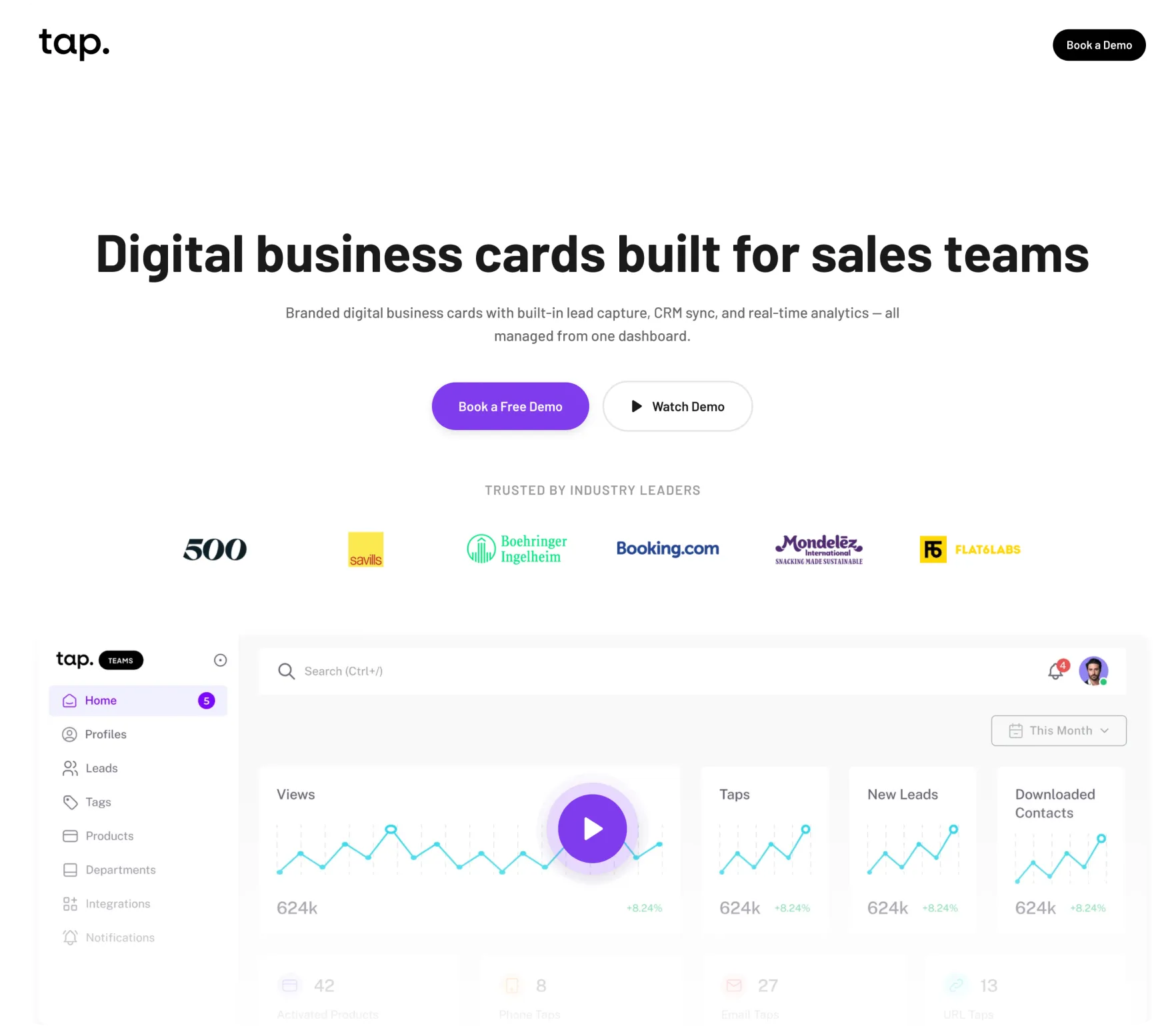
Reduce Distractions and Refocus Attention
Simplify the page to keep users focused on the core value and the primary action, without visual or cognitive noise.
Changes
Remove the navigation to prevent users from drifting away from the page
Remove user tags to reduce unnecessary context switching
Increase the size of customer logos to strengthen credibility at a glance
Update the secondary CTA to “Watch demo” to better match user intent
Replace the static visual with a demo video to show real value in action
Reduce the visual height by half to improve balance and scannability
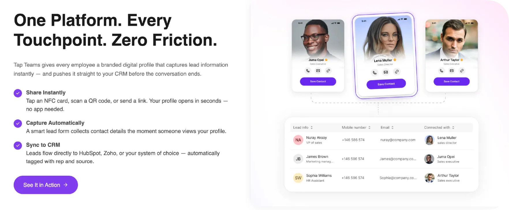
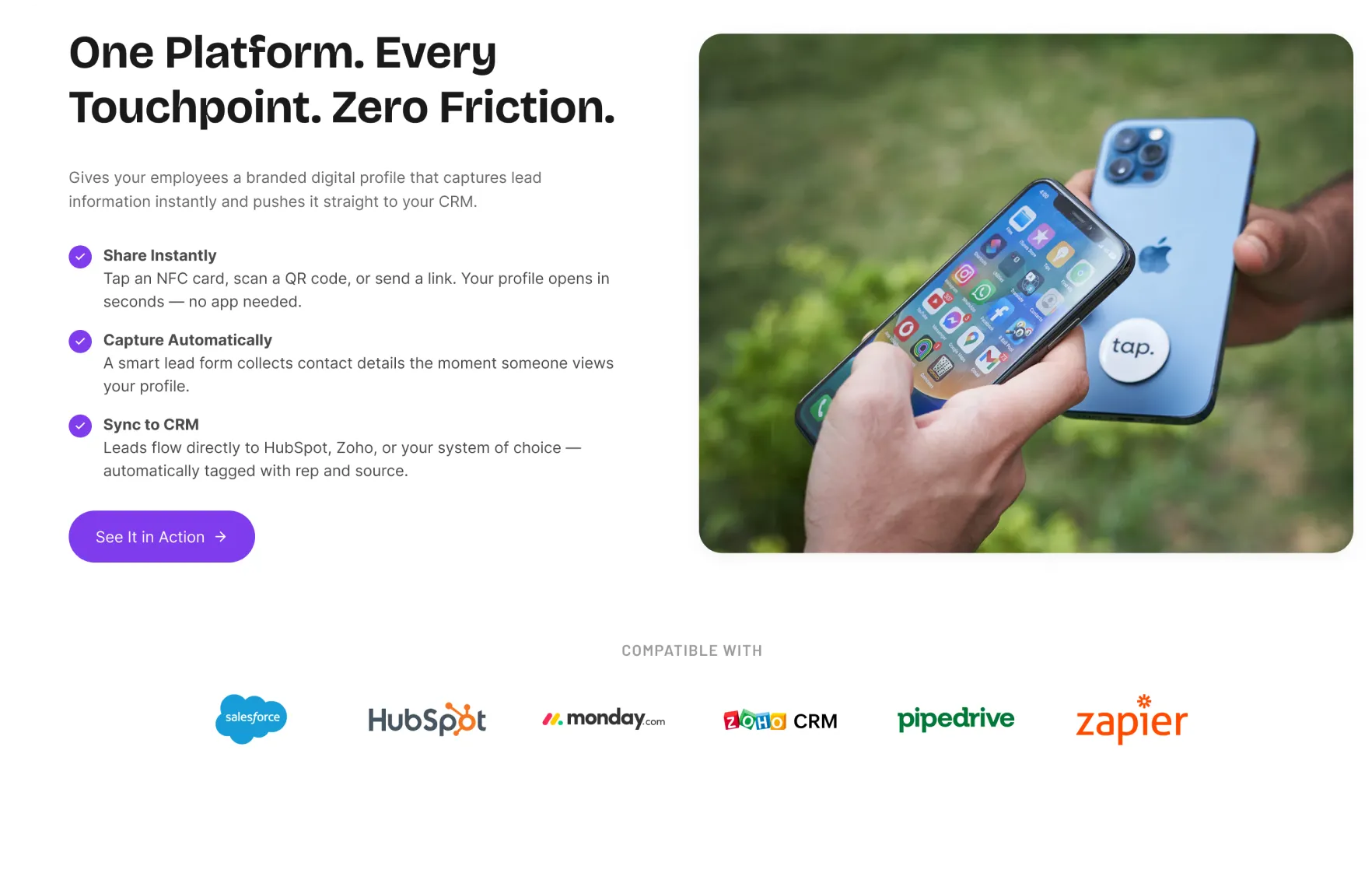
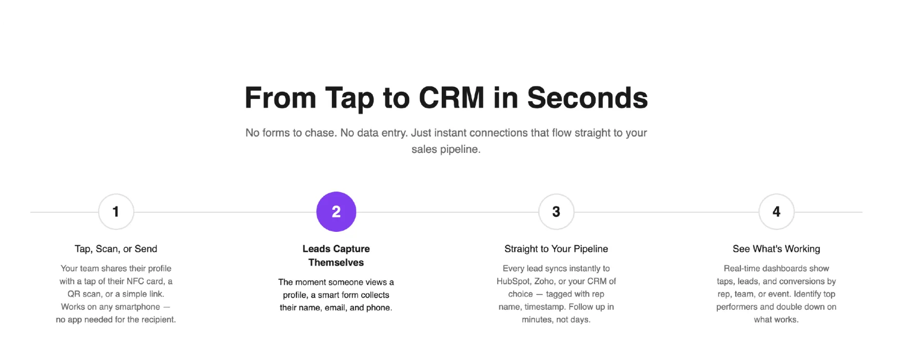
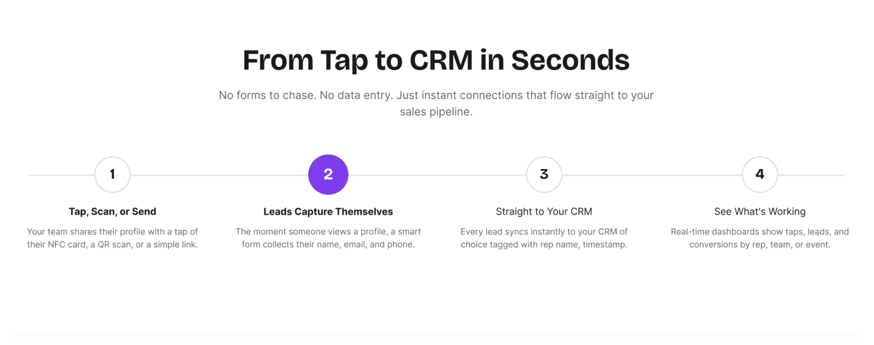
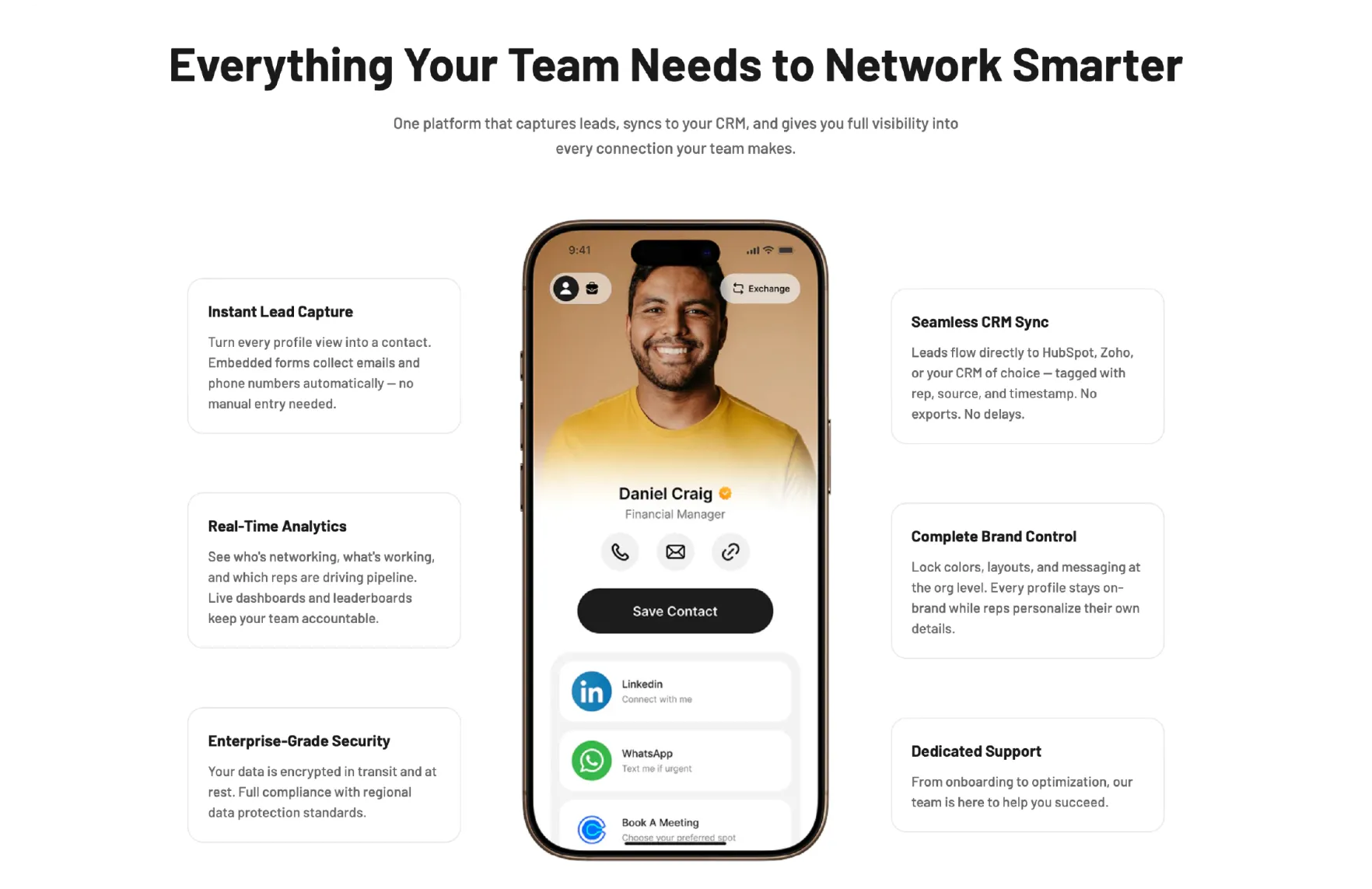
Make the Process Clear and Credible
Help users quickly understand how it works while reinforcing trust through familiar tools and integrations.
Changes
Replace the static visual with a short animated GIF that clearly walks through the process
Add CRM integration logos to highlight compatibility and reduce adoption concerns
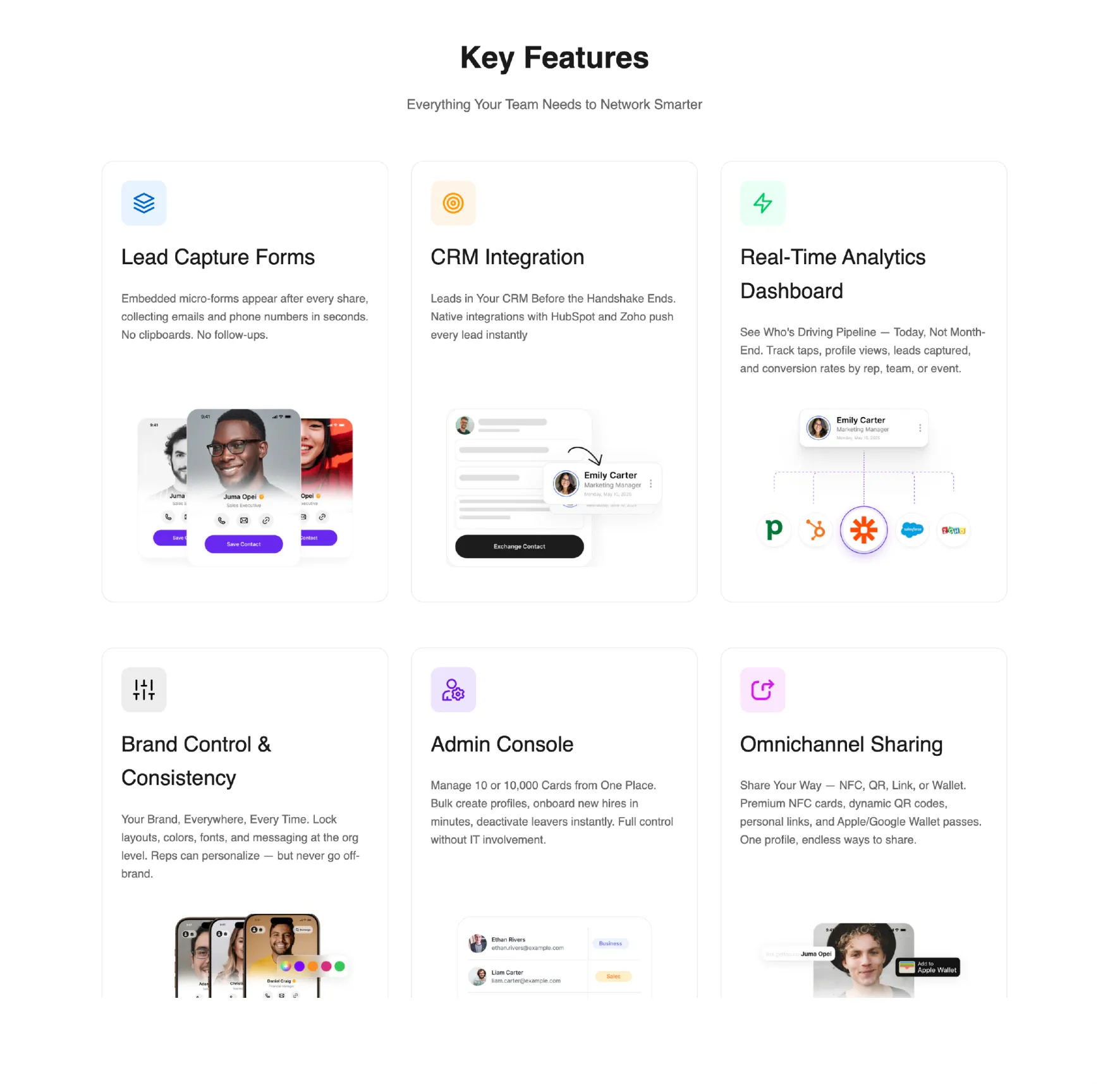
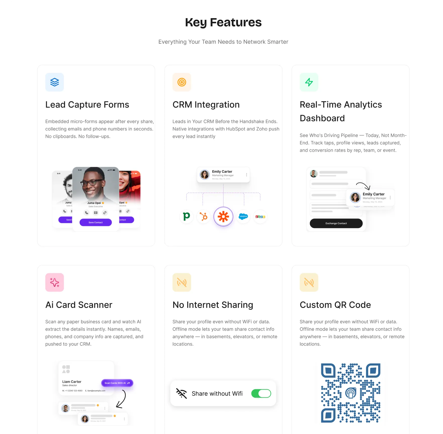
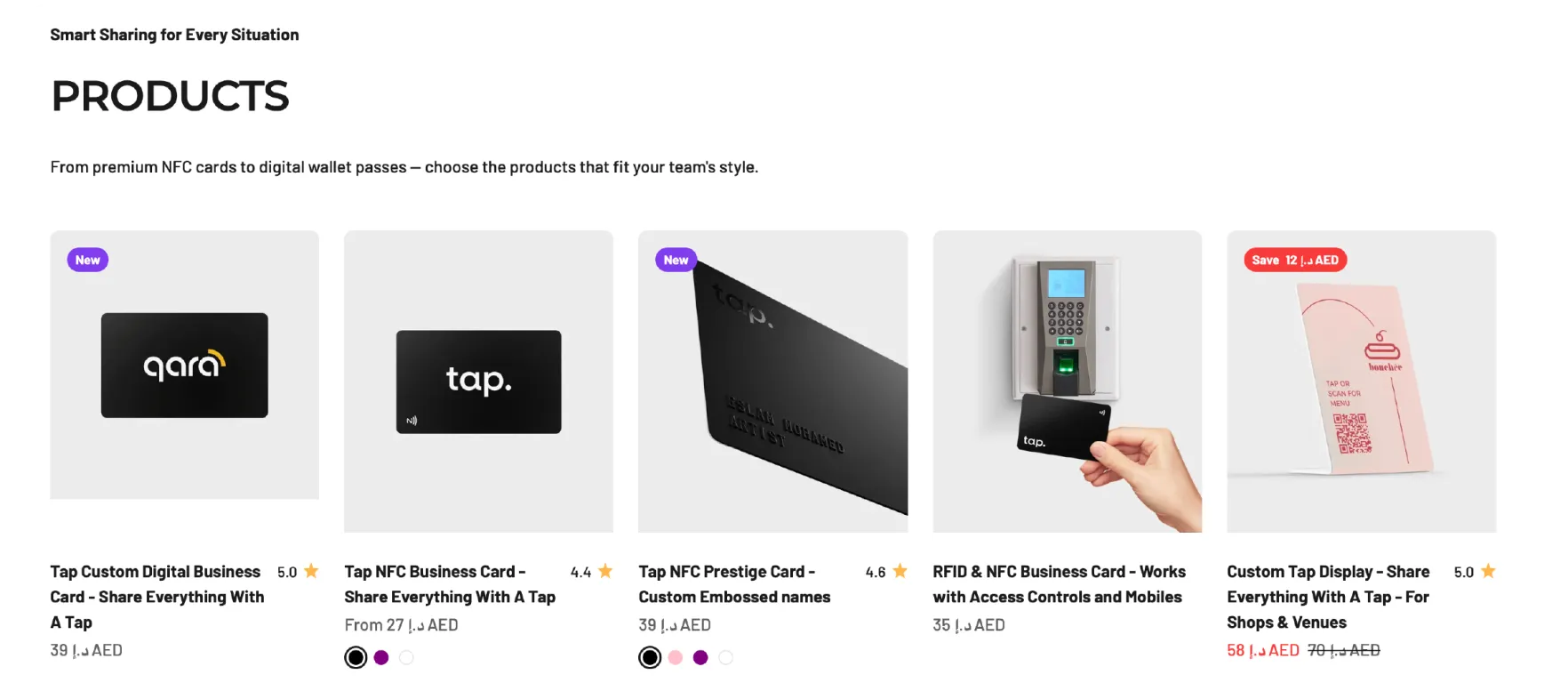
Refocus Features Around What Truly Matters
Streamline the feature set to highlight what actually drives attention, understanding, and perceived value.
Changes
Remove features that feel expected or add little differentiation
Separate offline sharing and QR codes into two distinct value drivers to give each the attention it earned
Move the second feature section to the top and merge both sections into a single, unified narrative
Fix the imagery mismatch so each card uses the correct, supporting visual
Improve Clarity and Scannability
Make the content easier to scan while ensuring each section adds fresh value instead of repeating what users already know.
Changes
Reduce text density to help users quickly scan and understand key points
Rewrite the copy to introduce new insights rather than restating earlier sections
Remove Low-Value Content to Maintain Focus
This section draws little attention, creates unnecessary cognitive load, and does not add to the overall story. Removing it simplifies the page, improves scannability, and preserves the narrative without losing value.
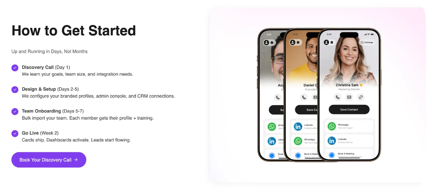
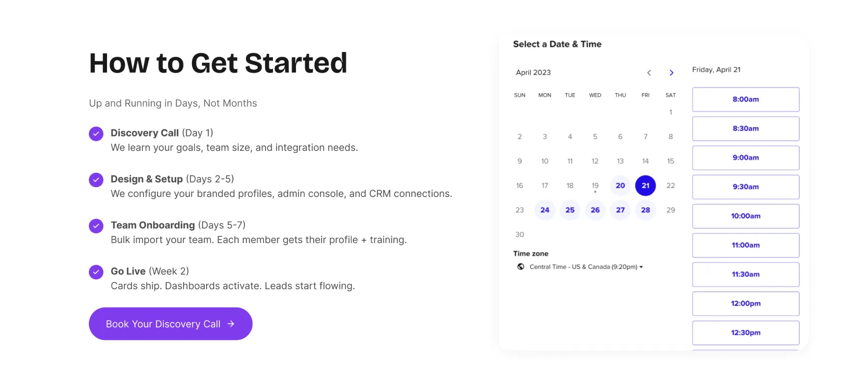
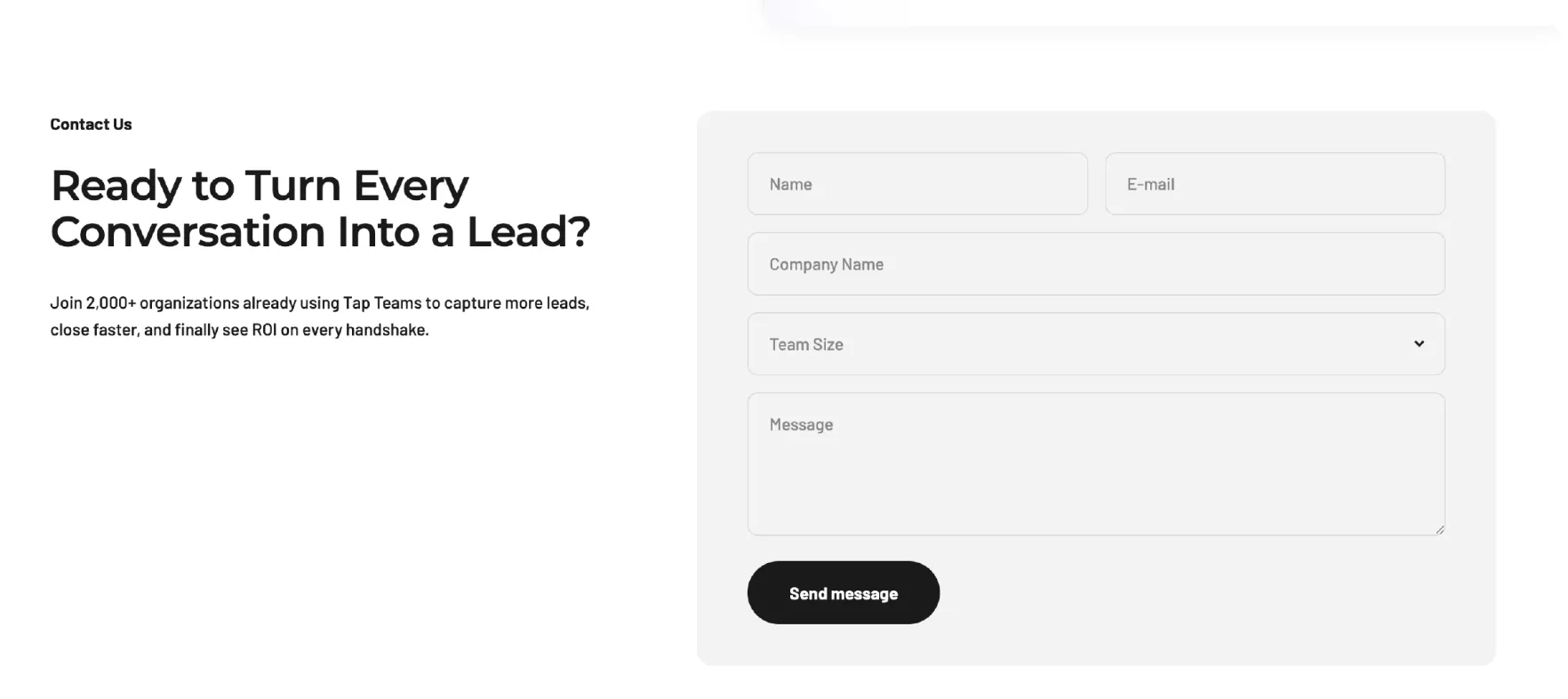
Reduce Friction to Book a Demo
Make it effortless for users to take the next step once they understand the value and the process.
Changes
Replace the visual with a Calendly embed to remove friction and enable immediate demo booking at the point of highest intent
Remove Redundant Content to Protect Focus
This section repeats what is already communicated above, adds no new value, and pulls attention away from the primary “Contact your work” CTA. Removing it keeps the page focused, intentional, and conversion-ready.

Remove Off-Audience Content to Avoid Confusion
The B2C product catalogue targets a different audience and introduces unnecessary confusion for B2B users, especially around pricing. Removing this section keeps the page focused on the right audience and avoids mixed signals.
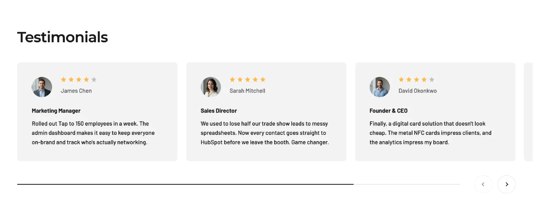
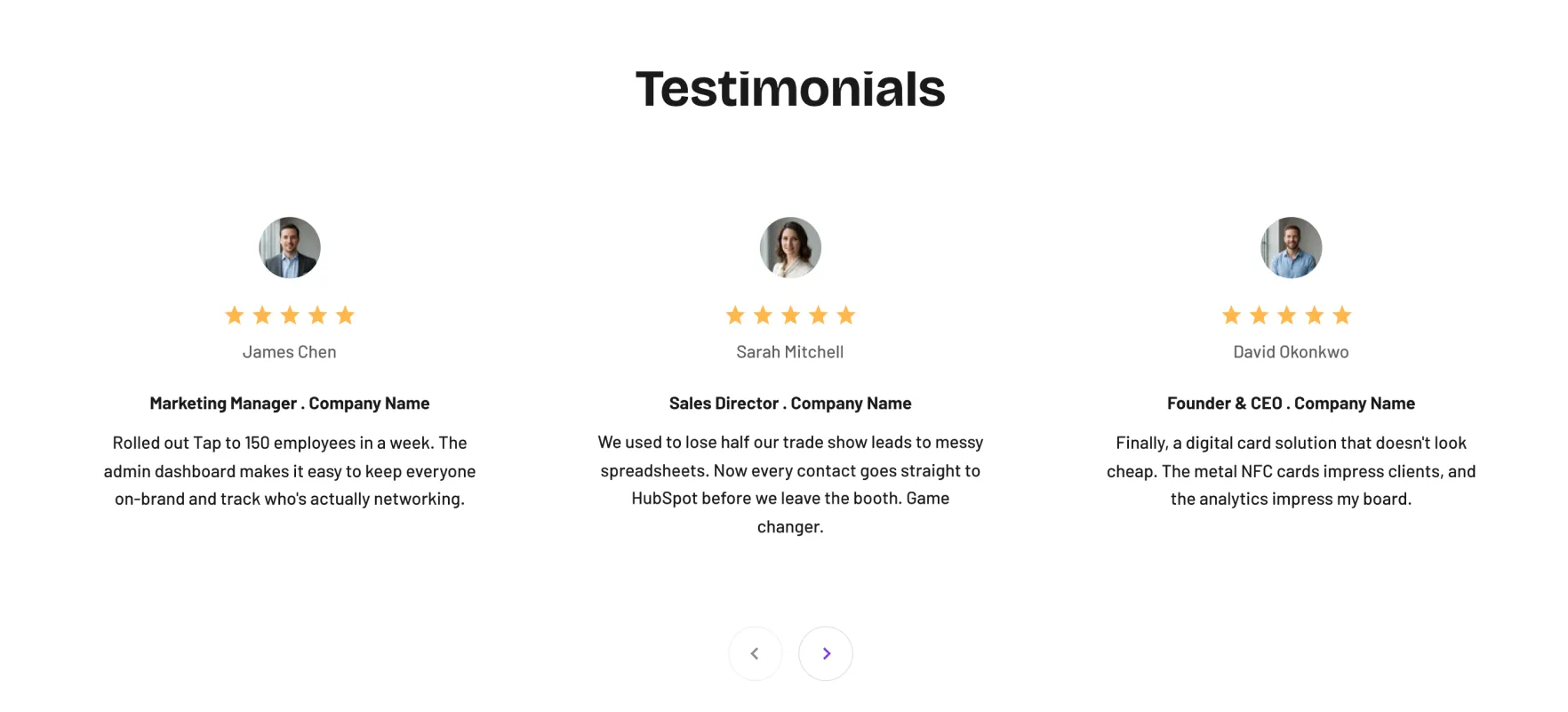
Strengthen Social Proof and Trust
Make testimonials easier to process and more credible by improving clarity, attribution, and visual emphasis.
Changes
Add the company name to each testimonial to increase credibility
Simplify the layout so testimonials are quicker and easier to digest
Increase the prominence of the star rating to reinforce trust at a glance
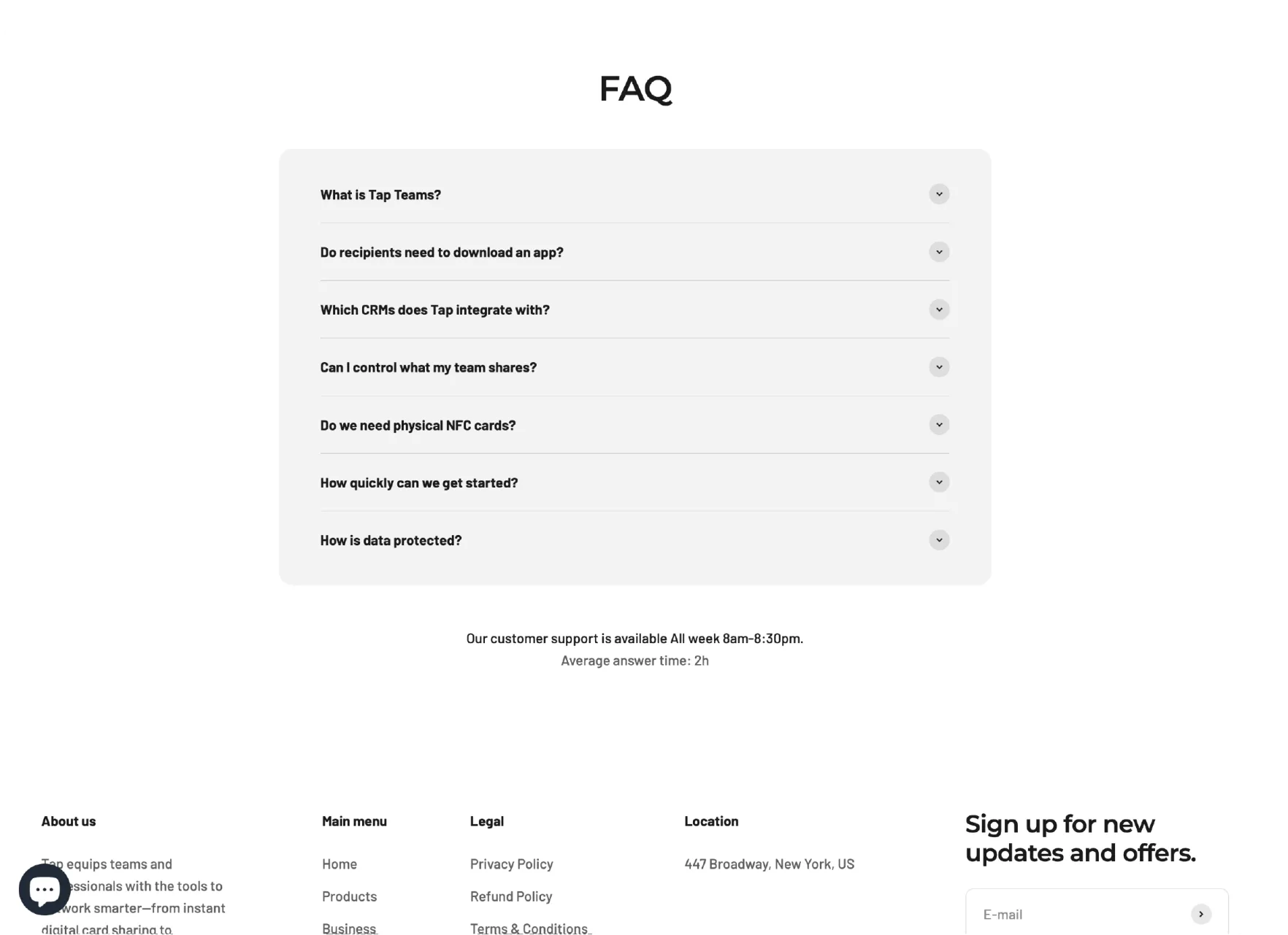
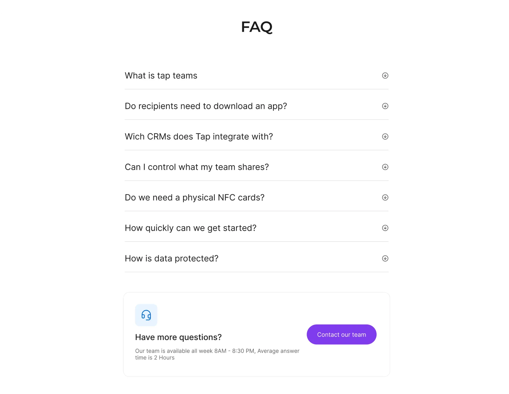
Improve Readability and Create a Clear Next Step
Enhance clarity and accessibility while giving users a clear way to continue the conversation if questions remain.
Changes
Increase text size to improve readability and scannability
Add a clear CTA inviting users to reach out with questions
Remove the background to reduce visual noise and keep focus on the content

Get this level of clarity
Tailored to your product, your users, and your goals, so you know exactly what's working, what isn't, and what to fix next.